// July 2023 – Sept 2024 (60 weeks)
Timeline
My Role
// Lead UX Researcher / UI Designer
Tools
// Figma, Photoshop, Jira, Confluence, Miro, Teams.
Methods
// Stakeholder Interviews, Journey Mapping, Usability Testing, Prototyping, A/B Testing.
The Problem
How can we reduce setup friction and empower crews to troubleshoot connectivity issues on Bombardier’s newest aircraft systems?
As Bombardier introduced a new onboard router, we were tasked with designing two integrated tools: a web-based setup interface to simplify configuration for technicians, and a mobile app to help flight crews and maintenance staff independently test and troubleshoot connectivity. By streamlining both the installation and the diagnostic workflows, our goal was to reduce support overhead, shorten deployment timelines, and improve the end-to-end connectivity experience across pre-flight, in-flight, and post-flight operations.
The Solution
Effortless Router Setup
Backend Web Platform Setup
We designed a streamlined web tool for technicians to quickly bind routers, validate configurations, and generate handoff summaries for DOMs. Clear language and step-by-step guidance reduced friction and setup errors in the field.
// UX Solutions: Engineers could bind routers, configure installs, and access saved bindings through a clean, minimal UI.
// 40% faster setup on average, with fewer support tickets and misconfigurations.

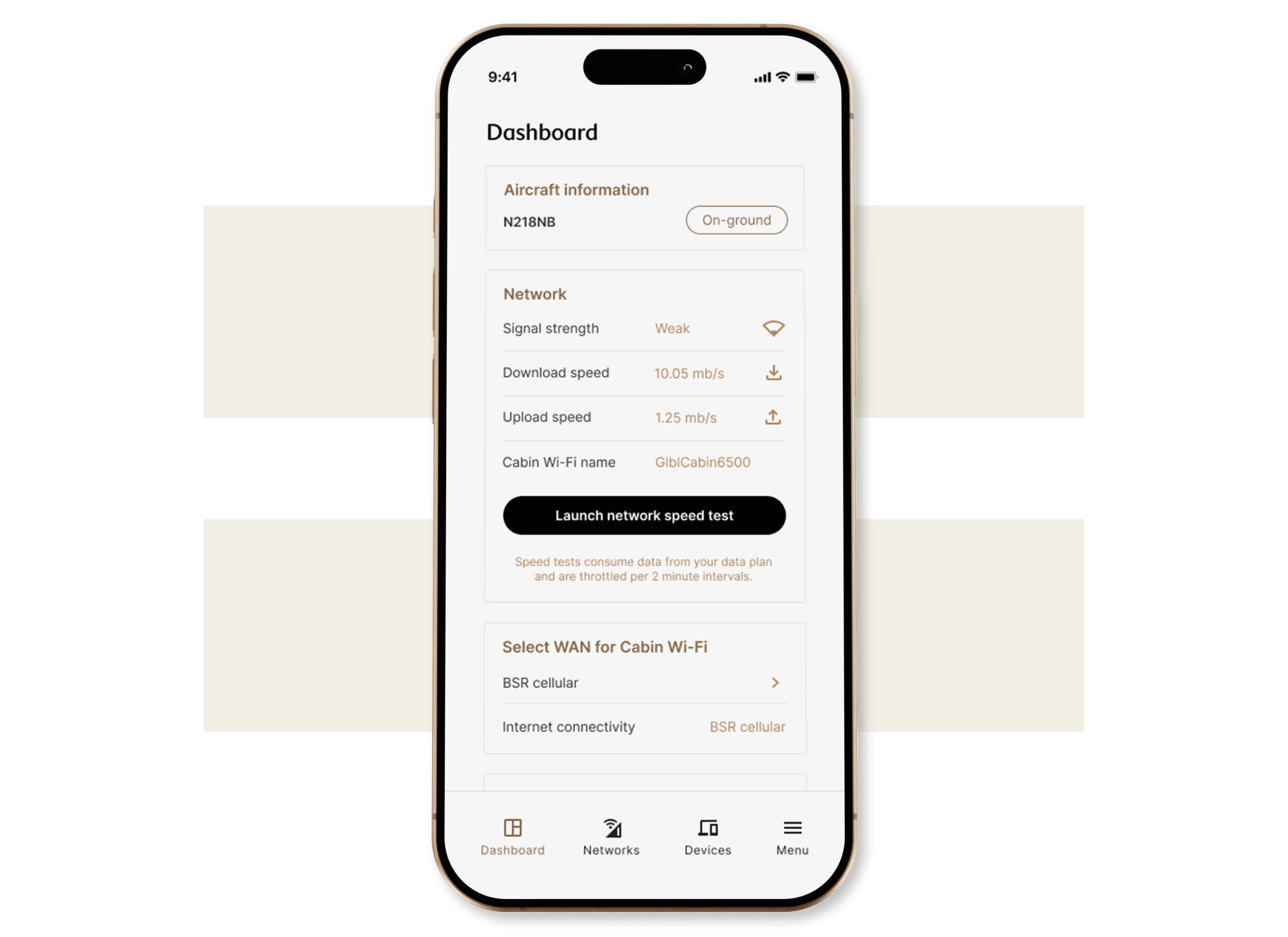
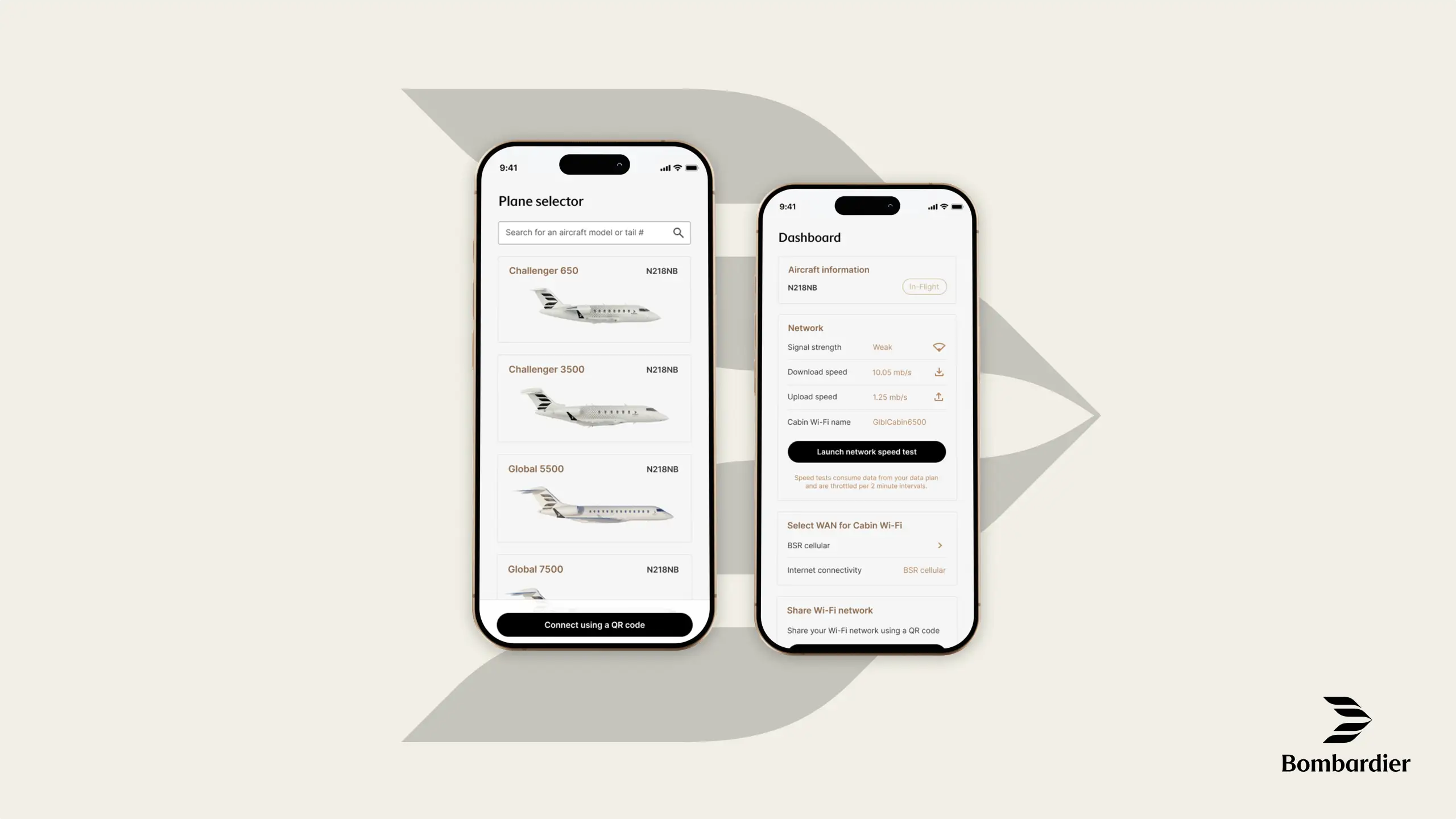
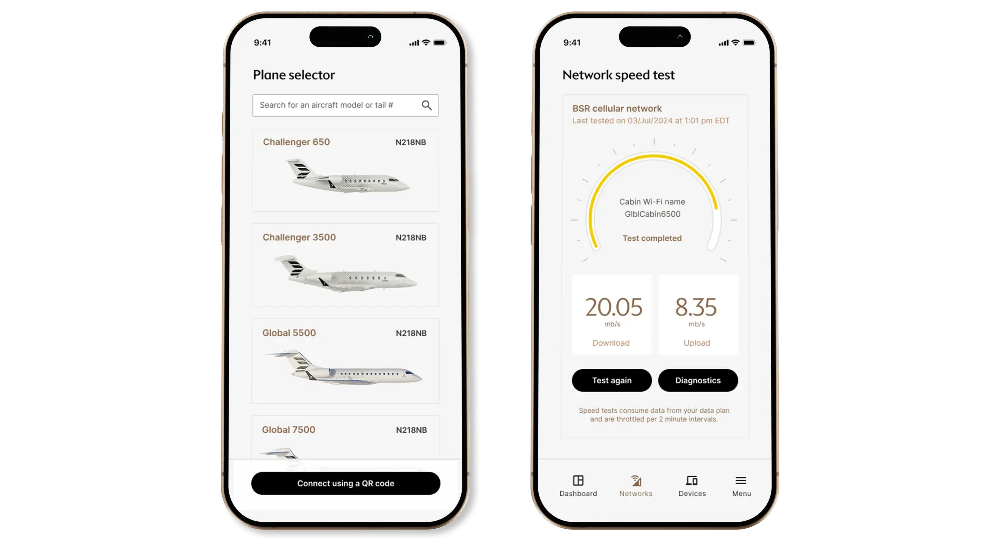
In-Flight Troubleshooting
// Crew-tested, crew-approved. We enabled flight staff to run live speed tests, view diagnostics, and monitor network health — all without calling tech support.
// 25% fewer inflight support tickets during pilot phase, with most issues resolved directly through the app.
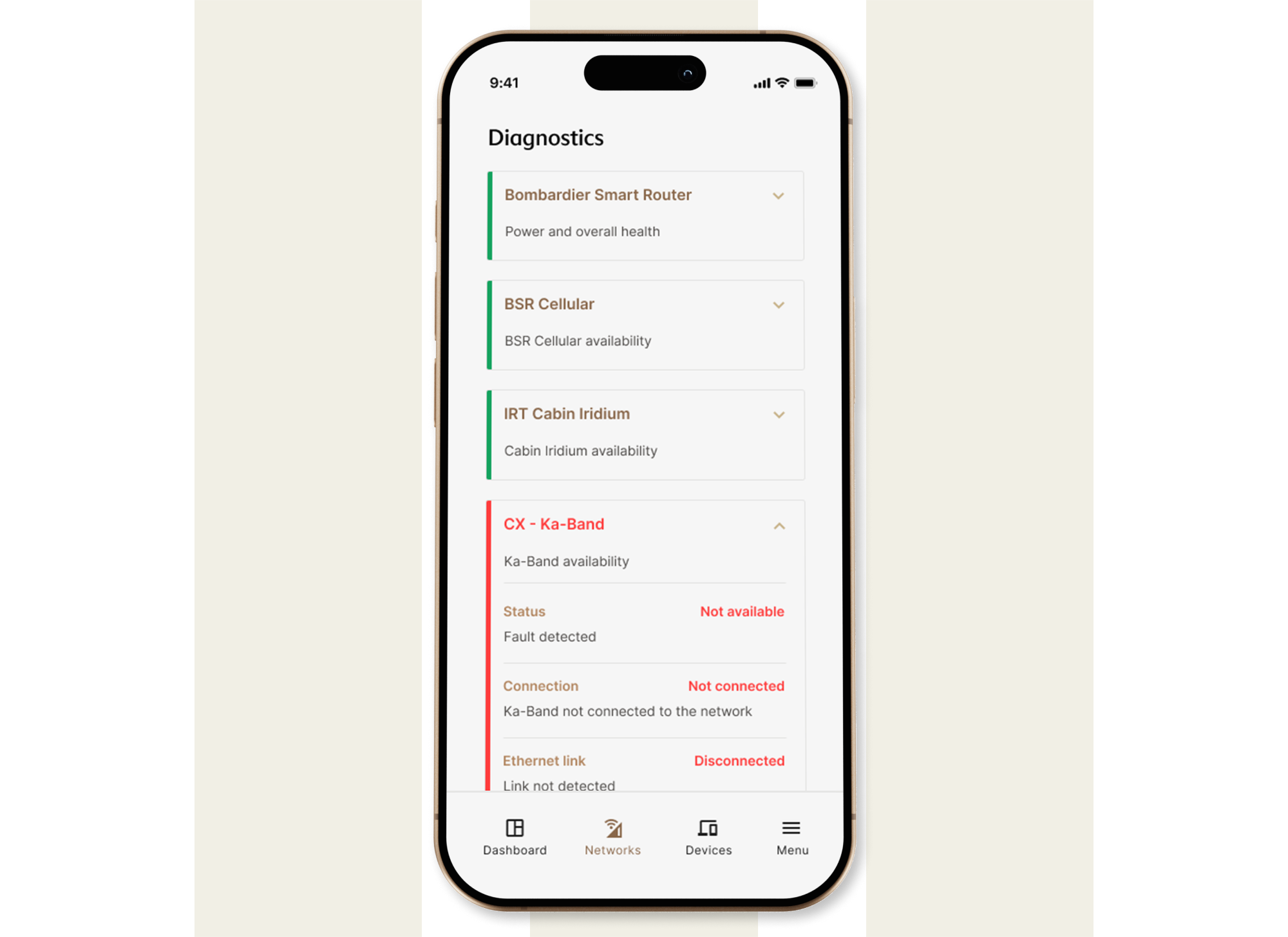
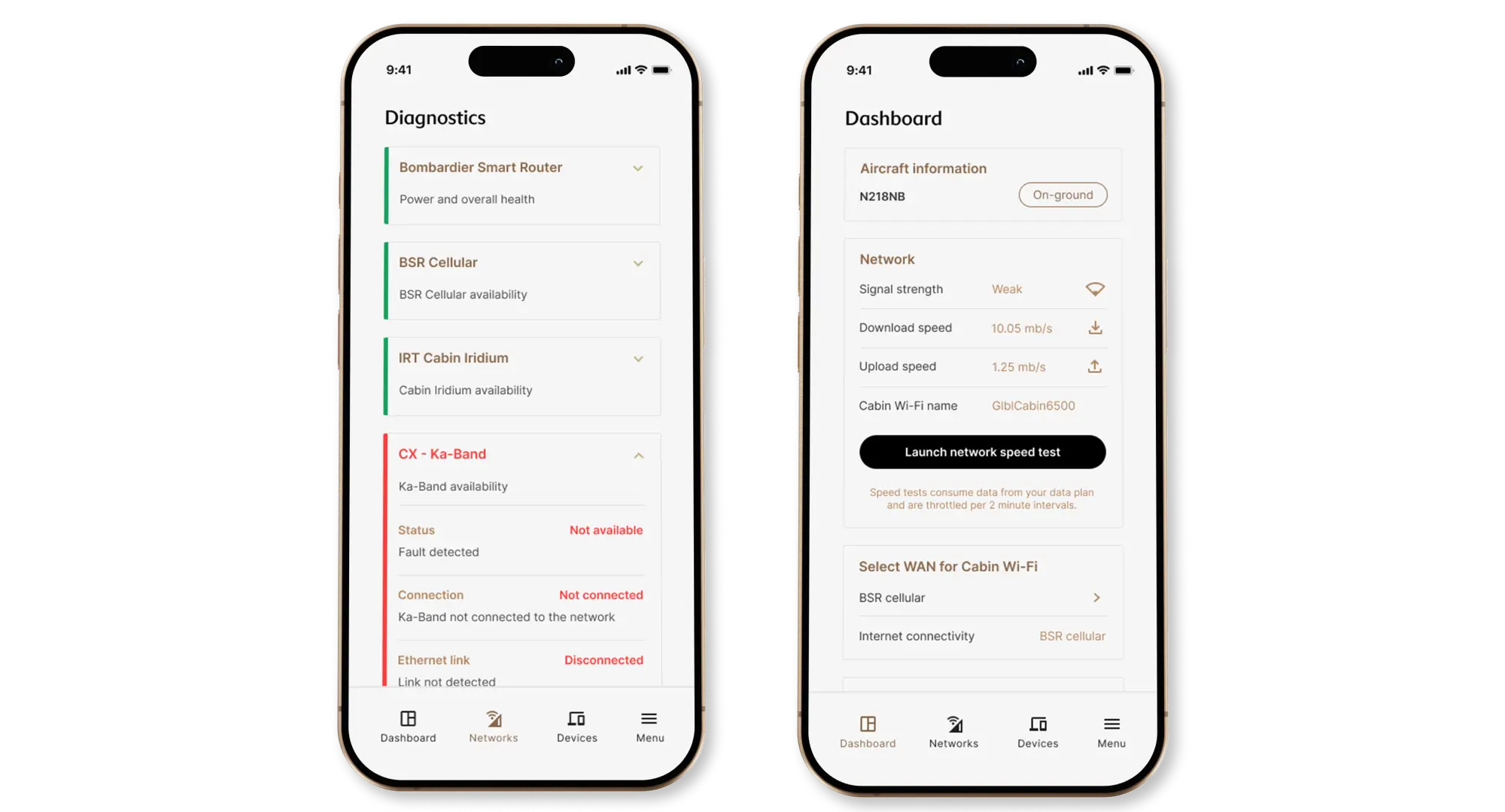
Self-Service Diagnostics
// Designed to support deeper investigation by maintenance teams, inflight or on the ground.
// Surfaces system-level health and component-specific faults in a clear, visual format.
// Equips DOMs with actionable data to assess severity and decide next steps independently.
// 85% of users resolved technical issues without IT during testing, even in low-connectivity conditions.
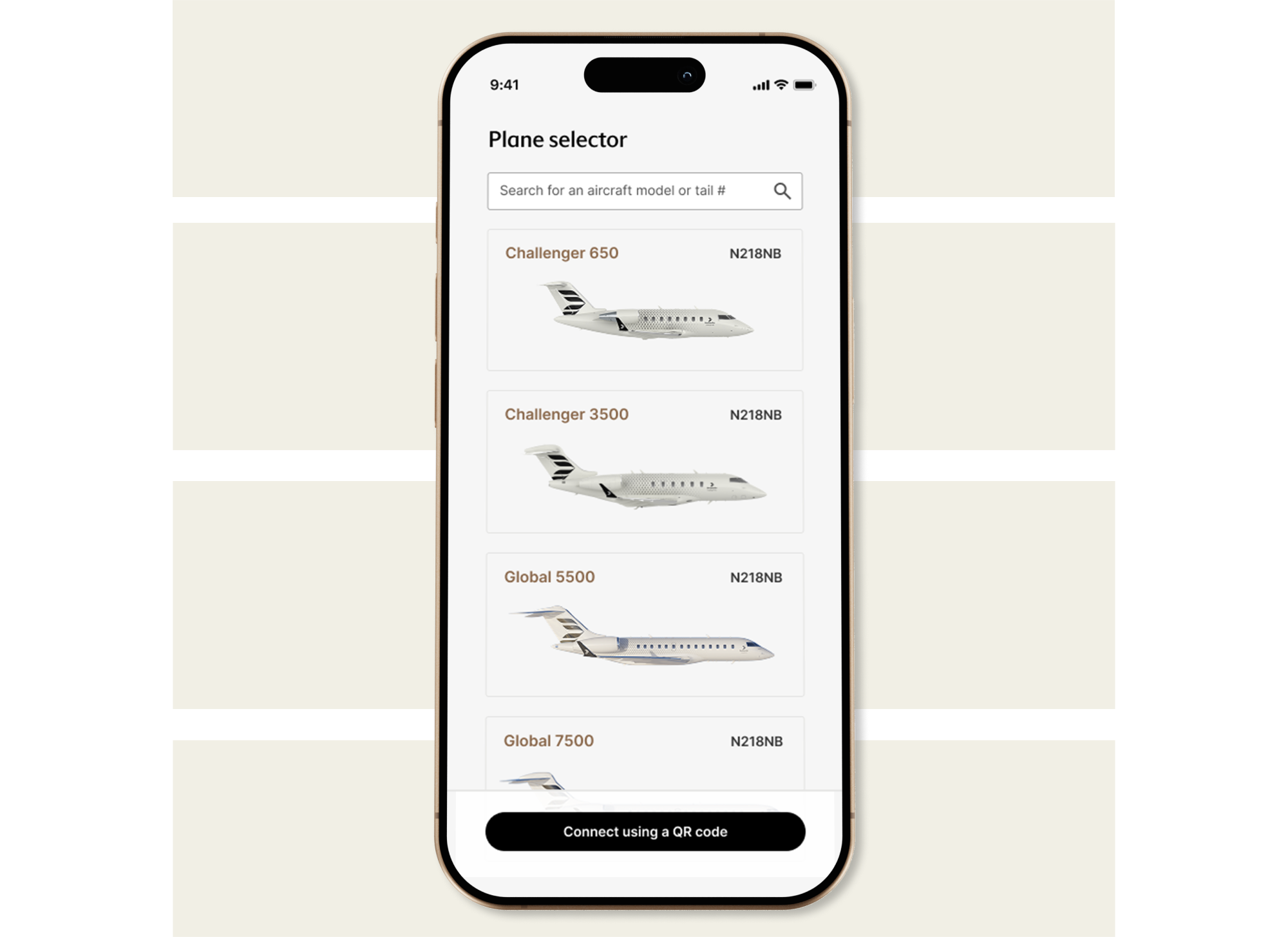
Fleet-Level Access & Context-Aware Control
// Plane Selector allows operators to seamlessly manage multiple aircraft.
// Taps into backend logic to display aircraft-specific diagnostics and settings.
// Scales from private owners to full fleet operators with no added complexity.
// 60% reduction in time spent switching between aircraft systems during testing and rollout.
Research & Discovery
Joining early mid-project, I introduced UX research practices to validate assumptions, map user needs, and shape a more scalable, role-friendly experience.
Our Research & Discovery phase was uniquely challenging; The application was being developed before the router hardware was finalized. My goal was to validate technical feasibility with engineers, uncover user needs through interviews, and shape a UX strategy that scaled across multiple roles and contexts.
Competitive Analysis
Reviewed router apps from brands like Netgear, TP-Link, and Eero to identify common expectations
We explored existing router apps like Netgear, TP-Link, and Eero to identify foundational patterns. Most apps offered speed tests, signal indicators, and device management (features users expect). However, none addressed multi-aircraft or fleet-level contexts, and diagnostic information was often buried or too technical.
This inspired us to:
Prioritize plain-language network health visuals
Introduce a dynamic aircraft selector for multi-plane owners
Design a modular dashboard that could expand over time, unlike static consumer router apps
Stakeholder Interviews // Primary Research
Talking to engineers and flight crews changed everything about who we were designing for.
Initially, we assumed that maintenance staff were the main users of the router. But through interviews, we discovered that flight attendants were the first point of contact during setup and in-flight troubleshooting. In smaller aircraft, that role often falls to the pilot. Meanwhile, DOMs (Directors of Maintenance) are only able to step in after landing.
We interviewed engineers to align our interface with technical capabilities, DOMs to improve post-flight diagnostics, and flight attendants, who helped us simplify the experience across different ages, roles, and comfort levels with technology.
Different users with the same goal.
Wi-Fi is everything. Whether it’s for the owner to work in the air or simply relax, every role on board is focused on keeping it running. What surprised us most? The people responsible for setup weren’t who we expected — and that reshaped our entire design approach.
These conversations didn’t just change our understanding of users, they reframed our scope. We weren’t building a tool for one expert role. We were building a system that had to flex between engineers, flight crews, and even pilots. That insight became the foundation for how we planned, tested, and prioritized the features that came next.
How might we...
Ensure a seamless connectivity experience for every user, whether they’re prepping the aircraft, troubleshooting in the air, or reviewing performance on the ground? 🤔
Designing the System Behind the Screens
Turning complexity into clarity. One role, one flow, and one screen at a time.
With multiple users, multiple aircraft, and a product still in development, our design process had to be as adaptive as it was intentional. This phase was about translating what we learned into usable flows and interfaces. Prioritizing what mattered most, aligning teams on feature scope, and making sure every screen had a clear job.
We collaborated across engineering, product, and operations to map experiences, vote on features, and sketch out journeys (not just for one user, but for all of them). These early decisions set the tone for how we designed with empathy, scale, and simplicity in mind.
User-flow
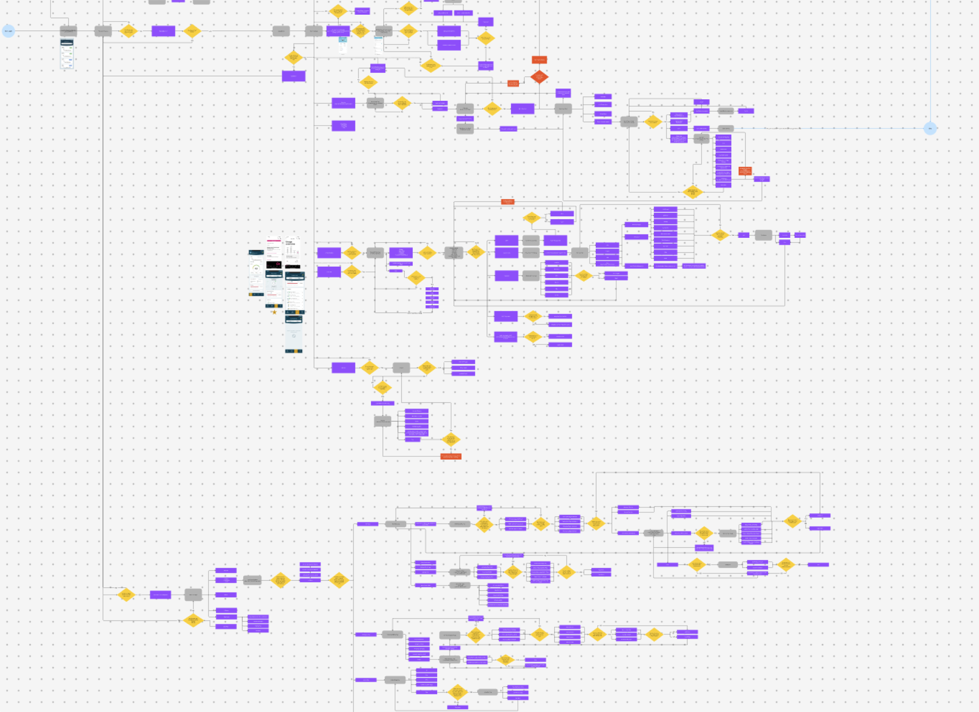
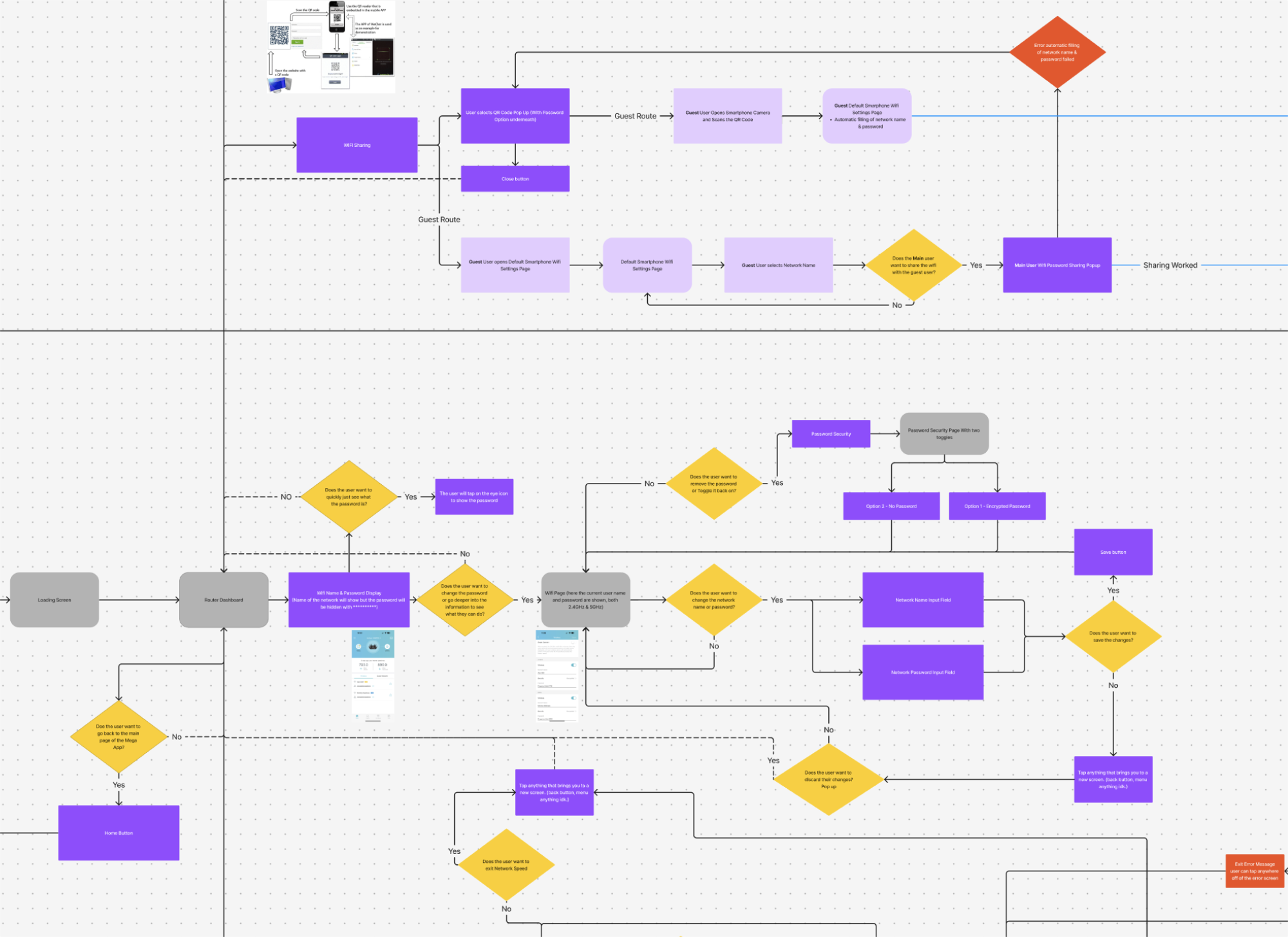
Mapping Every Interaction, Before a Single Pixel Was Designed
Before diving into visuals, I built comprehensive user flows to map out how different users — from flight crews to maintenance staff — would move through the system. Starting with foundational insights from our competitive analysis, I identified must-have features, then structured flows around real-world usage patterns and technical limitations.
The goal wasn’t just to visualize ideal paths — it was to uncover dark paths, edge cases, and setup scenarios that could cause friction mid-flight. These diagrams helped align the team early, validate feasibility with engineers, and ensure we weren’t designing ourselves into a corner. It also laid the groundwork for a seamless prototype later on.
Every flow was designed to be scalable and role-aware, accounting for users with varying levels of technical comfort — a theme that would continue into design and testing.
Feature Prioritization & Wireframes

Prioritizing What Matters
Using the MoSCoW method to align on what truly matters.
Before wireframing, we ran collaborative sessions using the MoSCoW method to define which features were essential for launch, and which ones could wait. This helped:
Align teams on must-haves vs. nice-to-haves
Simplify decisions by removing low-impact ideas
Ensure feasibility across engineering and design
This early alignment kept us focused, lean, and ready to scale with clarity.
Wireframes


Validating with Real Users
Did our design truly support users from cockpit to control room? We put it to the test.
Through multiple usability sessions with pilots, technicians, and ground crew, we uncovered what worked, and what didn’t. The insights directly shaped feature adjustments and led to measurable improvements across workflows.
What We Learned. What We Changed.
Designed for Flight. Refined by Real-World Use.
Before finalizing any designs, we put prototypes directly into the hands of the people who would use them every day. This included pilots, Directors of Maintenance, flight attendants, and aircraft technicians. We tested the mobile experience during flights and walked through the setup interfaces on the ground, all with one goal in mind: to ensure everything worked exactly where it needed to.
Our process involved a mix of in-person sessions, remote walkthroughs, and contextual interviews. Crew members tested the mobile app, while technicians explored the backend setup platform. We focused on key questions like: Was the experience intuitive? Did the terminology feel familiar? Could users complete important tasks quickly and confidently?
This cross-functional testing surfaced insights we hadn’t expected and helped confirm what was already working well. Honest feedback across roles and platforms laid the foundation for impactful design decisions.
What Changed: From Testing to Tangible Improvements


Clarity, Confidence, and Control: What We Improved
User testing revealed exactly where we needed to simplify, clarify, and prioritize. We redesigned the diagnostics dashboard to spotlight the most used feature: the internet test. Clearer labeling, color-coded indicators aligned with aviation standards, and faster access to key tools helped reduce cognitive load across roles. On the technician side, we reworked the setup interface by replacing jargon with task-based language and added the ability to print install summaries, making handoffs between technicians and DOMs seamless. Every change was rooted in feedback, and every screen became easier to use because of it.
Impact & Outcomes
From Insight to Impact: Proving the Design in the Field
What started as feedback turned into measurable improvements. By listening to users, iterating quickly, and testing in real-world scenarios, we delivered a product that not only worked, it worked better for everyone involved.
After implementing the redesigned diagnostics dashboard and simplifying key setup flows, we saw:
36% faster task completion when users tested connectivity during simulated flights
42% reduction in support requests related to router setup after introducing task-based instructions
2x higher user confidence scores in post-test surveys, with users reporting that the experience felt “familiar” and “easy to navigate”
Across testing sessions, one DOM noted, “This version feels like it was actually made for us. I can print what I need, and everything’s where I expect it to be.” A technician added, “I don’t need to guess what goes where anymore. The steps make sense. I just follow them.”
On the business side, these changes helped reduce onboarding time for maintenance staff and minimized the number of steps needed to activate in-air systems. This contributed to a smoother rollout and increased adoption across teams.
Every improvement was a result of direct feedback, and every metric showed that clarity, confidence, and real-world performance had become part of the product’s foundation.
If I had more time...
• Add smart defaults and walkthroughs for new users.
• Explore more edge cases unique to each crew type.
• Create better ways to surface relevant info faster.
• Give users more control to tailor the experience.
Takeaways & What I’d Do Differently With InFlight
This project pushed me to prioritize clarity over control. I learned how much value there is in removing complexity, not just for users, but for teams too. Next time, I’d lean harder into modularity, letting users personalize their tools to fit the way they actually work. Thinking in flows instead of screens helped me stay focused on outcomes instead of just features.