

Portfolio redesign with AI
- Product designer · UX writer · Front-end builder
- Iterative · 2026
- Solo project + AI collaborators
This is the portfolio you are looking at. I set the references, interaction feeling and editorial direction; designed the screens from scratch; and reviewed every project flow. I used Codex and Claude to move faster between ideas, critique and implementation, but every decision came back through me.
12
2
3
The narrative problem
I had a lot of work, but the collection was not doing enough to explain why each project mattered. A visitor had to commit to a full case study before knowing whether it was relevant to them.
The problem was not a lack of detail. It was pacing. Every project opened with context, then process, then the work. The result was accurate, but it asked for patience before it had earned attention.
I wanted the portfolio to feel more like a conversation: give someone the useful answer early, show the evidence, and leave room for the messy thinking if they want to keep going.
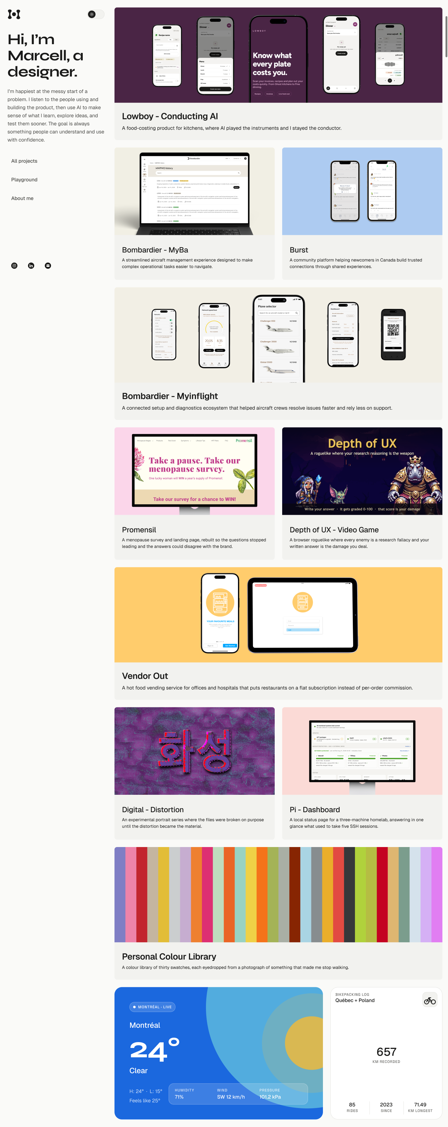 Work first
Clear routes
Choose your depth
Work first
Clear routes
Choose your depth
What I wanted to change
I started with an information and layout brief, not a moodboard. It gave the redesign a job: lead with the result, alternate payoff with explanation, keep the writing human, and make a shorter version of every story possible.
That brief became the design system's first constraint. The visual language could be quiet and expressive, but it could not hide the work or turn every project into the same template.
01
Result first
Open with the strongest visual or outcome so the reader knows why to care.
02
Pace is a choice
Give every case study a Detailed view and a TL;DR view without changing the facts.
03
Evidence earns space
Use the artifact, the decision and the consequence. Cut process that does not change understanding.
The brief before the build

A case study should feel like a story, not a process report.
I wrote down the editorial rules before writing components. That gave me something to push against whenever a page started becoming a generic portfolio template.
The rules I kept visible:
Show the result early, then step back into the reasoning.
Keep one canonical set of facts across both reading depths.
Make every meaningful image legible and openable.
Treat uncertainty and constraints as part of the story.
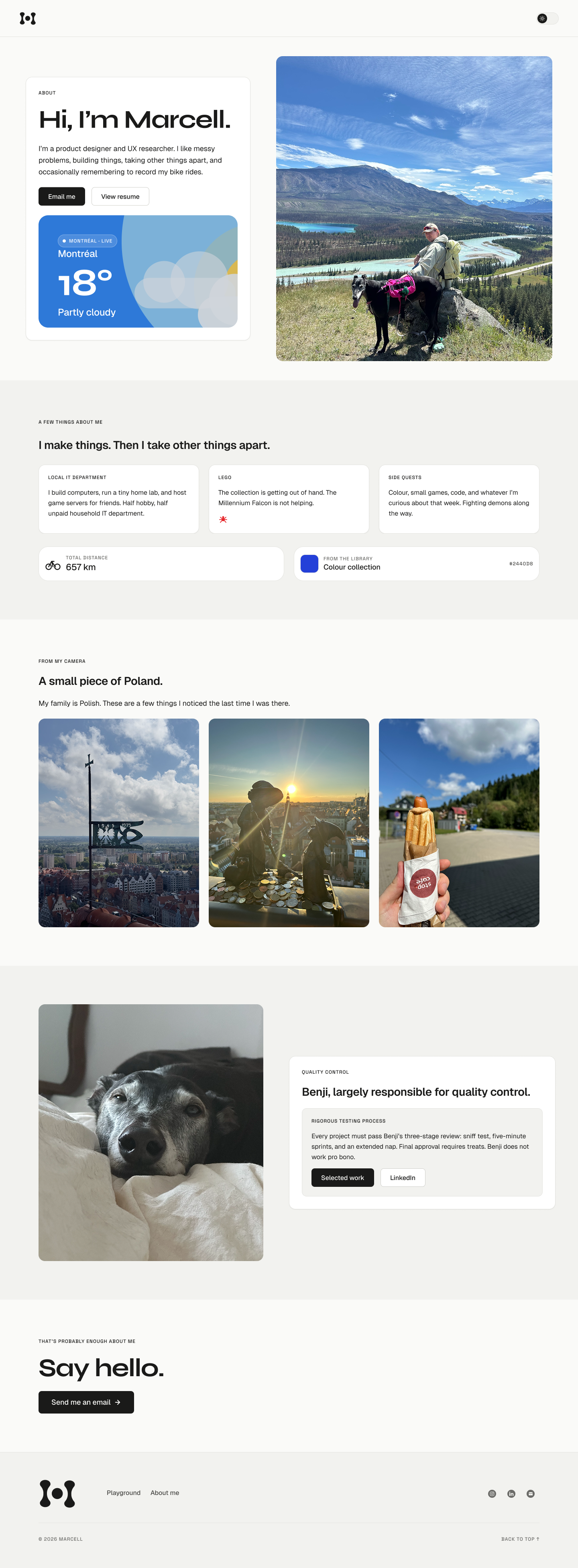
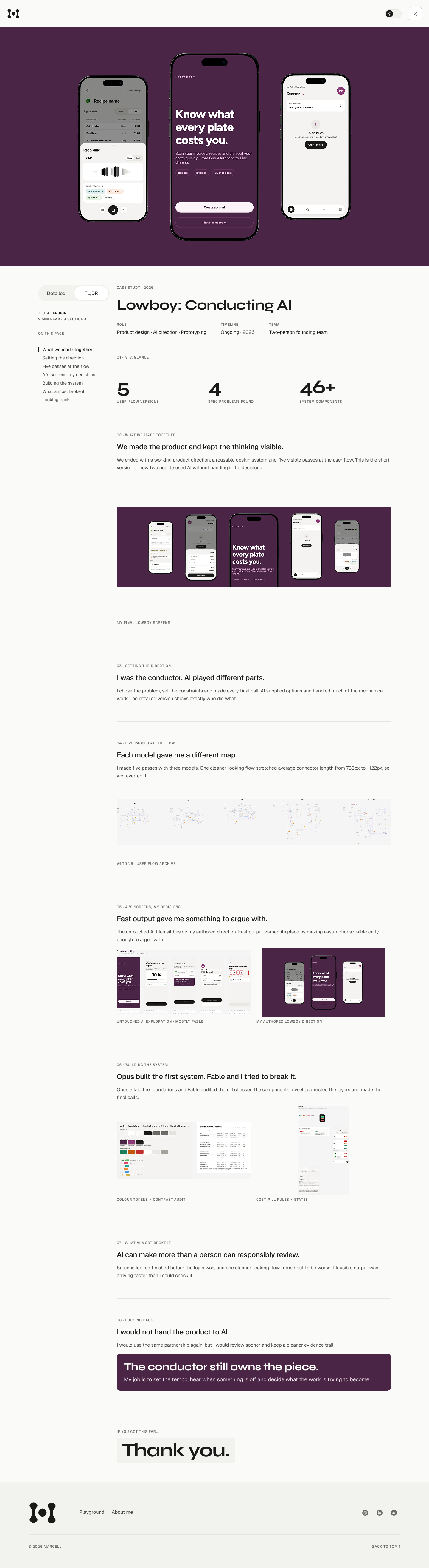
One visual language. Three different reading jobs.
The home page scans, About slows down, and a case study goes deep. The system connects them without forcing every page into the same rhythm.
The loop I directed
I did not ask AI to invent the portfolio’s point of view. I brought references, described how the system should feel in motion, defined the reading experience and orchestrated the design-system ideation. Then I created the screens from scratch and used AI to challenge them, explore alternatives and suggest features or components I might push further.
The useful pattern was directed collaboration: I made a design decision, AI helped me expand or implement it, and I reviewed the result against the references and the actual project story. AI increased my range and speed. It did not replace taste, authorship or the final call.
01
Direct
I set the references, feeling, interaction intent and constraints.
02
Design
I made the screens and established the hierarchy from scratch.
03
Expand
AI helped push variants, features, components and implementation.
04
Review
I tested the result, corrected the misses and decided what stayed.
Set the point of view. Make the design. Decide what ships.
References · interaction feeling · screens · evidence · final call
Generate range and challenge the story.
Alternatives · hierarchy · sequence · claims
Turn chosen decisions into working systems.
Components · features · responsive states · implementation
“Give me range, not the answer. I’ll decide what earns a place.”
Where AI actually helped
It shortened the distance between my direction and something I could evaluate.
I arrived with a direction rather than a blank prompt. AI gave me more variations to react to and helped turn approved decisions into working components. I still reviewed every result in context and corrected the work when it drifted.
Useful jobs for AI in this project:
Compare several story structures against the editorial direction I set.
Push a screen further with optional features, components and interaction states.
Translate my approved screens into component structures and responsive states.
Run a first QA pass that I could verify manually rather than accept on faith.
The build
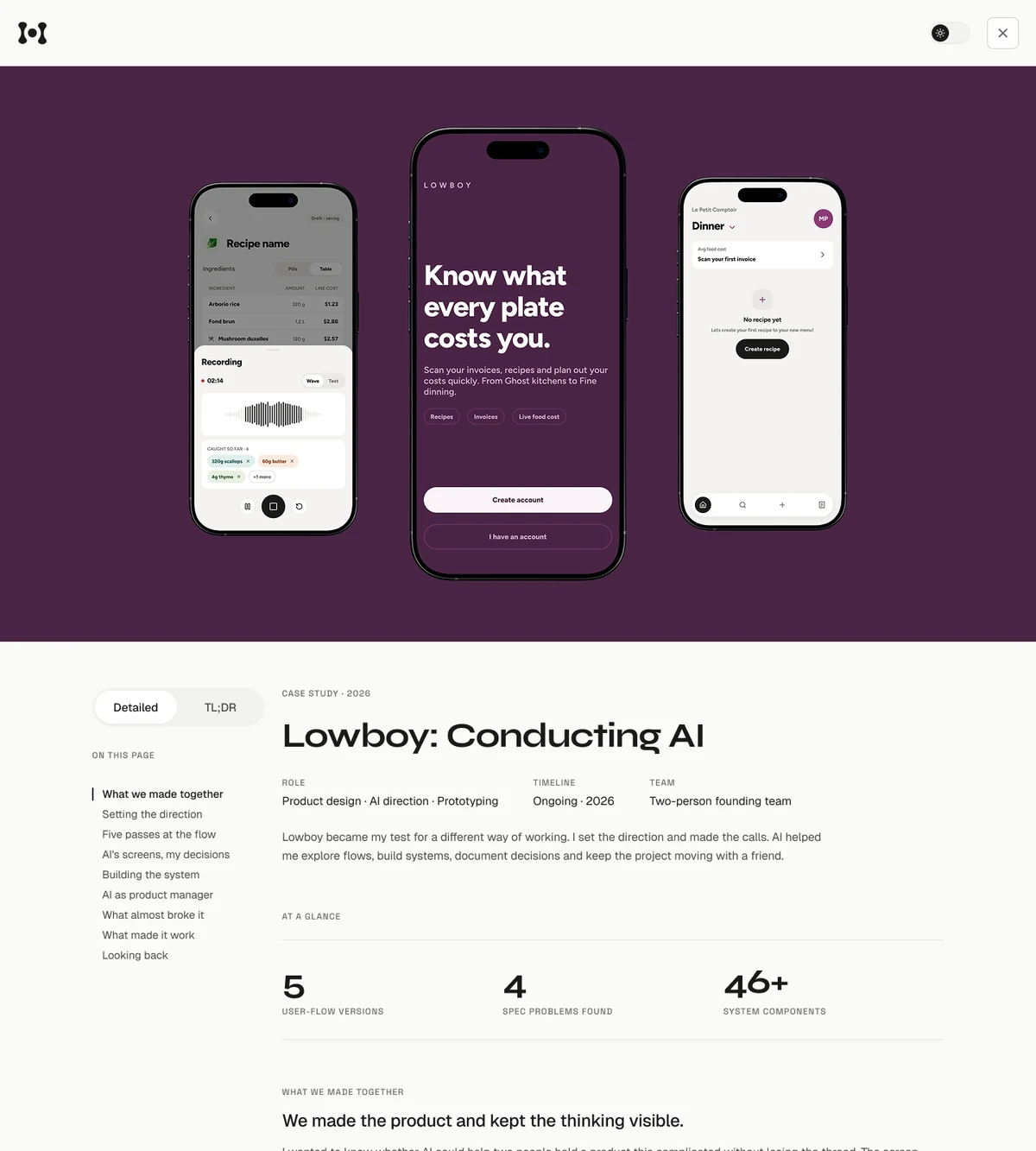
Once I was satisfied with the story and screens, I used AI to help translate them into a small editorial system instead of twelve one-off pages. I reviewed the implementation as it took shape: Astro keeps the output static and fast; the shared shell handles navigation, themes, reading depth and lightboxes; each project keeps its own voice and evidence.
That split was my design decision. AI made the repetitive implementation faster, while I kept the project-specific parts open and reviewed the shared behavior whenever one change affected the rest of the site.
Canonical project data
Facts, metadata, section copy and image descriptions live together so the Detailed and TL;DR versions agree.
Shared case-study shell
The header, footer, reading toggle, rail navigation and lightbox repeat with less friction.
Project-specific stories
Each page chooses its own chapters, rhythms, visuals and moments of uncertainty.
The toggle changes depth, not the truth.
Detailed holds the complete narrative. TL;DR uses the same facts and visual language, edited for someone who needs the essential decisions first.
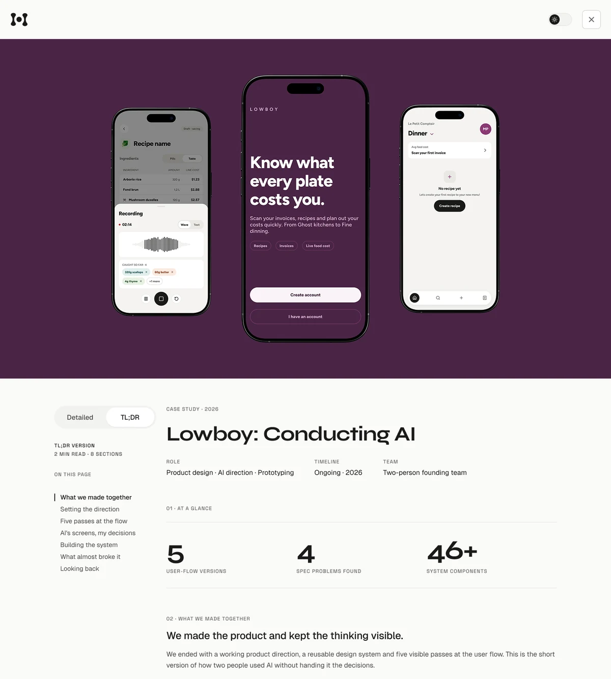
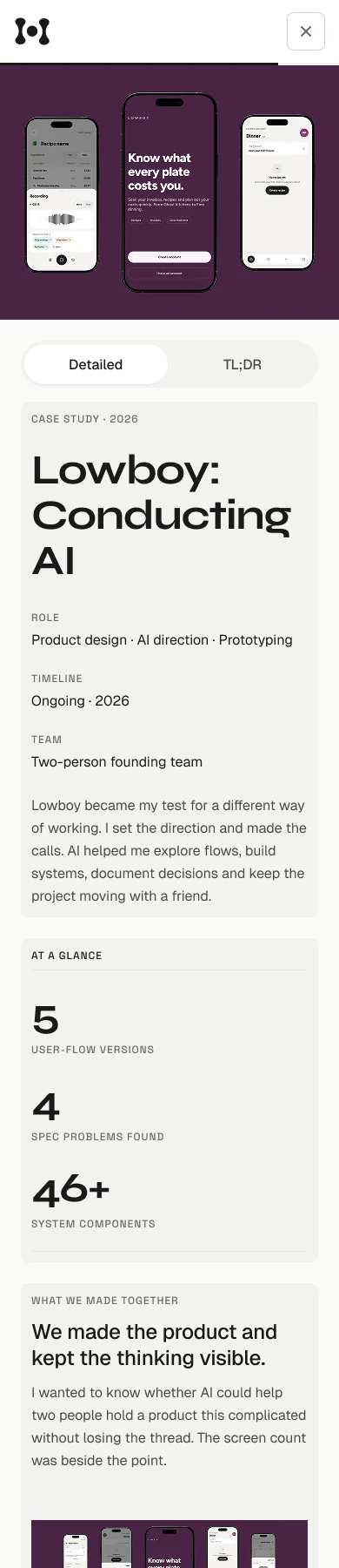
/lowboy/
/myba/
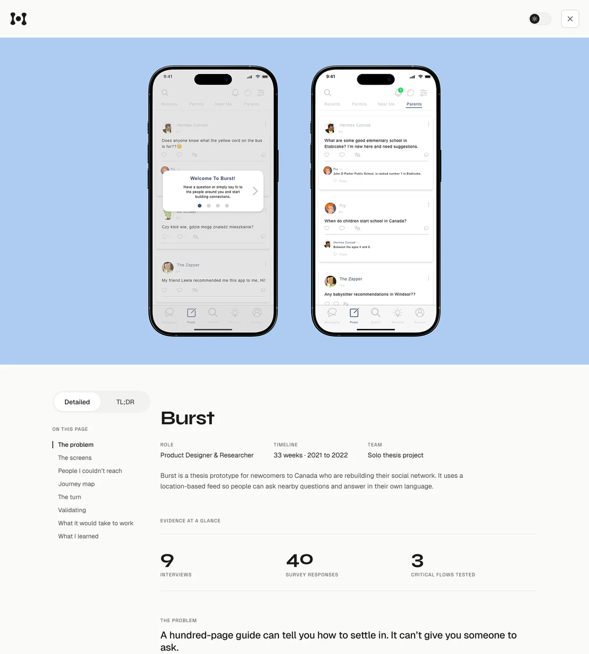
/burst/
/myinflight/
/promensil/
/depth-of-ux/
/vendor-out/
/digital-distortion/
/pi-dashboard/
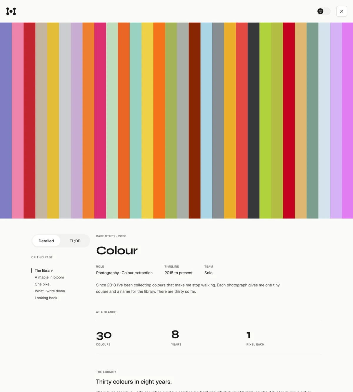
/colour/
/bikepacking/
/portfolio-redesign/
The collaboration in practice
I kept the work moving in small passes I could inspect and redirect.
Every pass produced something I could read, click or compare with the source design. That let me catch drift early instead of allowing an AI-generated assumption to spread across the system.
A typical pass:
Set or revise the references, interaction intent and brief.
Create the screen and identify what I wanted to push further.
Ask AI for variants, additions or implementation options—not one answer.
Choose the direction, then build the smallest version that makes it visible.
Review the content, interaction and rendered page myself before it ships.
The system
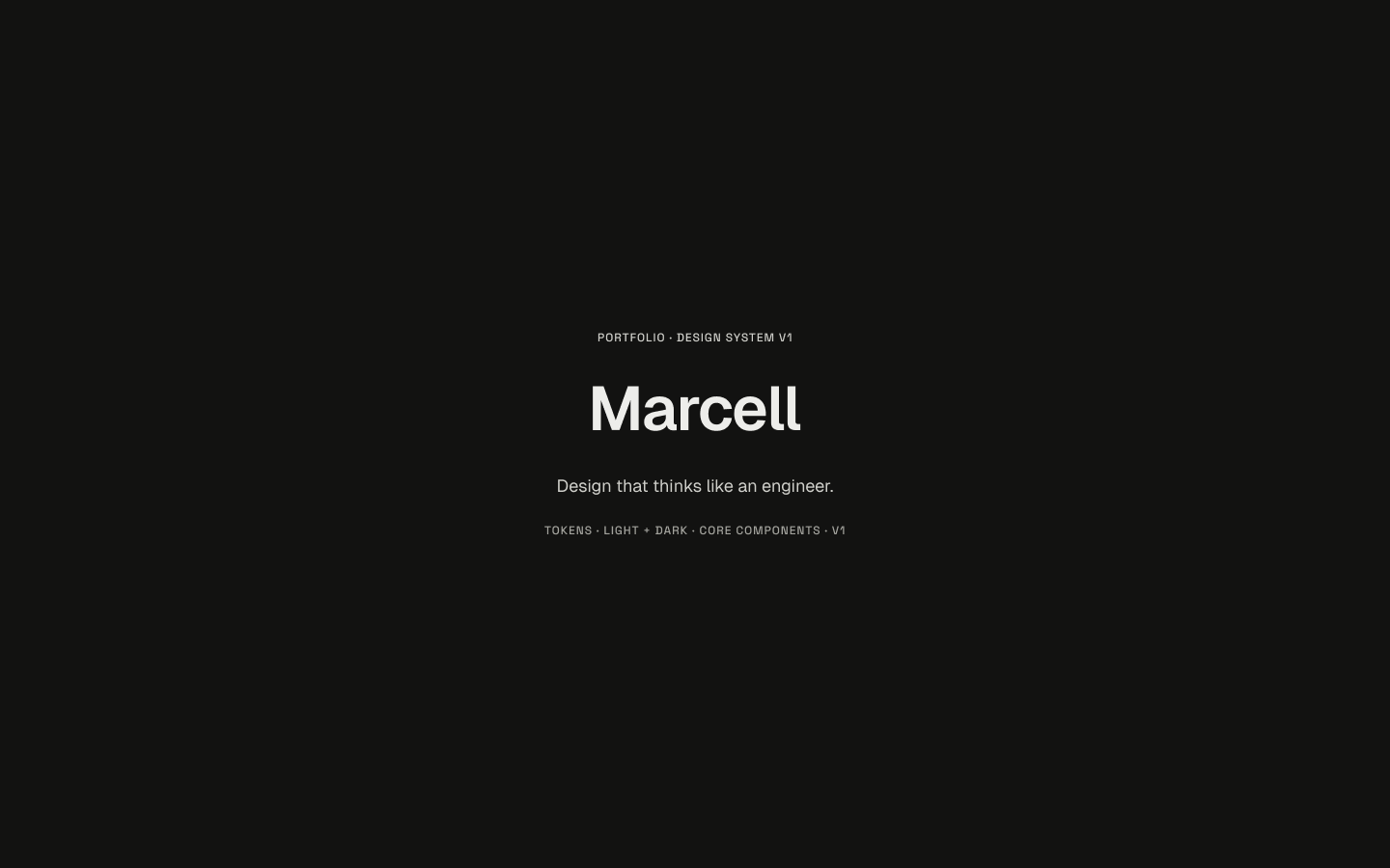
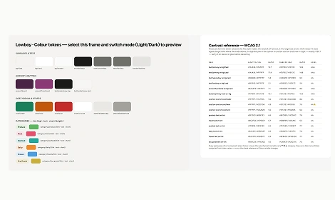
I orchestrated the visual foundation through references, interaction feeling and the needs of the project stories. In Figma I established the cover, logo, light and dark intent, and early layout decisions. I then designed the screens from scratch and used AI to help extend the approved patterns into code-level tokens, shared components, responsive rules and templates in Astro.
The system lives across design and implementation, but its point of view came from my review of every page and flow. Its job is not to make the portfolio consistent at all costs; it gives the work a shared grammar while each project keeps its own rhythm, colour and personality.
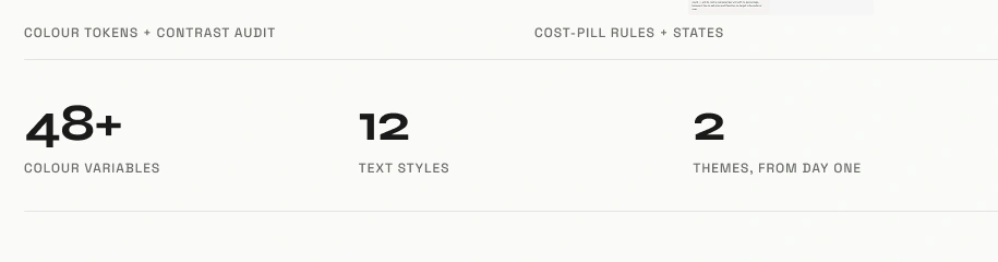
3
2
1
The shell stays familiar. The project sets the mood.
The checks
There is no meaningful conversion number yet, so I did not invent one. I validated what I could actually observe: can the page be understood, can the story be navigated, and does the build behave at the edges?
AI helped generate checklists, run routes and report failures, but its “passed” result was never the final word. I tested the site myself because automated QA could miss behavior that only appeared after a particular sequence of scrolling, section navigation and Escape-key use.
I checked that roles, timelines, metrics and outcomes agreed across Detailed and TL;DR.
I repeated real navigation sequences after automated tests said the individual controls worked.
I reviewed desktop, tablet and mobile visually instead of trusting viewport numbers alone.
A pass report was a hypothesis, not approval.
Routes loaded, responsive widths held, and Escape navigation appeared to return visitors correctly.
After using case-study section links, Escape could go back only one history step instead of home. Returning from a project could also land halfway down the homepage.
Single-image lightboxes still showed previous and next arrows because a CSS rule overrode the hidden state. I caught it visually, traced the conflict and retested both single images and galleries.
What I checked before calling it done
A page can be technically complete and still feel wrong.
The last pass combined automated checks with a slower editorial read. The build caught errors; the read caught the parts that were technically fine but not helping anyone.
The practical checklist:
Run Astro type checks and the production build.
Check the route, title, description and canonical URL.
Resize the page and look for clipped or hidden copy.
Switch between Detailed and TL;DR mid-page and confirm position holds.
Open a representative image and use the keyboard to close it.
Read the first screen as someone who has never met me.
Repeat the exact interaction sequence myself after an automated report says it passed.
Where AI stopped
AI could propose a polished structure before it understood the project, make every section sound equally important, or produce more copy and components than a reader needed. It could also report that QA passed when its test path had not reproduced the sequence where the experience failed.
My work was not simply accepting or rejecting outputs. I supplied the references, made the screens, reviewed every project and flow, and tested the behavior myself. The most important design act remained deciding what was supported, what deserved a larger stage and what should not ship.
- Generate range
- Surface repetition
- Build a first pass
- Find missing states
- Choose the story
- Own the claims
- Protect the reader's time
- Verify the reported pass
- Decide when enough was enough
What I learned
The redesign changed how I think about using AI in design work. The gain was not that a machine made a portfolio for me. The gain was that I could direct more iterations, test ideas sooner and move between writing, structure, code and critique without losing the thread.
Speed only mattered because I remained the deciding factor. I brought the point of view, designed the screens, reviewed the evidence and corrected the experience when the tools were confidently wrong.
Thank you.